

Desiging for Education Colour Palettes

Colour plays an important role in educational settings with the power to influence students’ emotions, cognitive abilities and overall learning experiences.
Colour Palette Recommendations by Age Group:
Early Childhood:
Preferred Colours: Bright, warm and high-contrasting colours such as red, yellow, blue and green.
Design Insight: Young children are naturally attracted to vibrant, bright colours which can stimulate engagement and excitement, and compliment their energetic, extrovered nature.
Primary School Age:
Preferred Colours: Vibrant but slightly more subtle colours like softer shades of blue, green and yellow.
Design Insight: As children grow, they respond well to colours that are lively without being overstimulating, supporting focus and learning.
Intermediate and High School:
Preferred Colours: Deeper, cooler colours such as navy blue, forest green and burgundy.
Design Insight: As students come into their teenage years, they tend to view primary colours as immature and prefer sophisticated tones that create a conducive learning environment.
Tertiary (University):
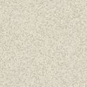
Preferred Colours: Neutral and muted tones like beige, grey and soft blues and greens.
Design Insight: Mature learners benefit from environments that are calming and free from distractions, aiding in concentration and study.

Tarkett
iQ Eminent
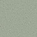
Dusty Green
Tarkett
Primo Safe.T
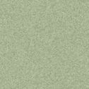
Medium Green
Tarkett
Primo Premium
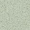
Light Green
Regupol
Ultimate
Yuma (Shape Kush) 4mm
Tarkett
Omnisports Reference Multi-Use (6.2mm)
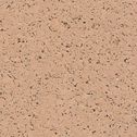
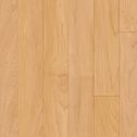
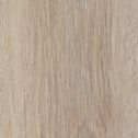
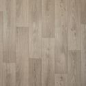
Golden Maple
Carpets Inter
Breaking Waves Over the Ocean
Seagrass Ecosoft
Shaw Contract
Accent
Kakadu (Peridot)
Tarkett Desso
Desert
AC89-7852
Shaw Contract
Nordic
Driftwood
Tredsafe
Inserts Subtle Colours
Jade Green 43 mm
Shaw Contract
Welcome II
Portabella

Tarkett
Etrusco
Olive

Tarkett
Protectwall 1.5mm
Uni Kaki
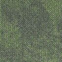
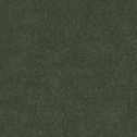
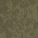
Green:
Associated with calmness and concentration; reduces anxiety.
Recommended use: Effective in libraries and mental wellness rooms to create a safe, peaceful atmosphere.

Tarkett Desso
Desert
AC89-8915
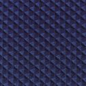
Tarkett
iQ Eminent
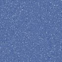
Blue

Tarkett
Etrusco
Petrol
Tarkett
Wallgard
Blue 1.3mm
Regupol
Classic
Sydney (Tone) 4mm
Carpets Inter
Breaking Waves Over the Ocean
Gulf Stream Ecosoft
Tredsafe
Inserts Subtle Colours
Royal Blue 13 mm
Regupol
Ultimate
Boston (Shape Nome) 4mm
Shaw Contract
Welcome II
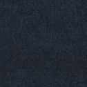
Navy
Tarkett
Primo Safe.T
Medium Blue
Tarkett
Primo Premium
Dark Blue
Tarkett
Traffic 250
Swan Driftwood
Shaw Contract
Accent
Blue Mountains (Azure)

Tarkett
Omnisports Reference Multi-Use (6.2mm)
Uni Sky Blue
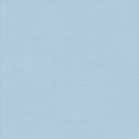
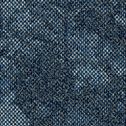
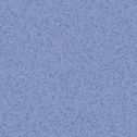
Blue:
Calming and promotes productivity; associated with improved focus.
Recommended use: Ideal for classrooms and study areas to enhance concentration.

Shaw Contract
Accent
Great Sandy Desert (Tigers Eye)
Tarkett
Primo Safe.T
Medium Warm Beige
Tarkett
Primo Premium
Soft Yellow
Tarkett
iQ Eminent
Pale Yellow
Regupol
Ultimate
Yuma (Shape Kush) 4mm
Tarkett
Triumph and Inertia
Fortunate
Tarkett
Omnisports Reference Multi-Use (6.2mm)
Golden Maple
Tarkett Desso
Desert
AC89-6118
Tarkett
Traffic 250
Swan Blonde
Tarkett
Wallgard
Yellow 1.3mm
Tredsafe
Inserts Safety Colours
Signal Yellow 43 mm

Tarkett
Etrusco
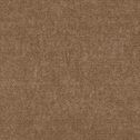
Honey

Tarkett
Protectwall 1.5mm
Uni Ochre
Carpets Inter
Ebb Wash
Estuary Sand Ecosoft
Shaw Contract
Welcome II
Black Chocolate
Yellow:
Bright and energetic; can enhance mood but may cause eye strain if overused.
Recommended use: Best used as an accent to stimulate creativity without overwhelming the senses.
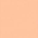
Orange:
Warm and inviting; stimulates social interaction.
Recommended use: Suitable for cafeterias and common areas to encourage communication.

Tarkett
Wallgard
Orange 1.3mm
Tarkett Desso
Desert
AC89-5121
Tarkett
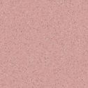
Primo Premium
Soft Red
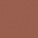
Tarkett
iQ Eminent
Brick

Tarkett
Omnisports Reference Multi-Use (6.2mm)
Uni Tonic Red
Regupol
Classic
Sidon (Core) 4mm
Carpets Inter
Breaking Waves Over the Ocean
Red Coral Ecosoft
Regupol
Ultimate
Lagos (Shape Goa) 4mm

Tarkett
Etrusco
Candy
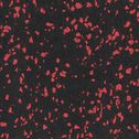
Tredsafe
Inserts Safety Colours
Safety Red 43 mm

Tarkett
Protectwall 1.5mm
Uni Terracotta
Shaw Contract
Welcome II
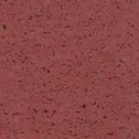
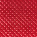
Red
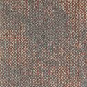
Shaw Contract
Accent
Burgundy
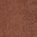
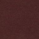
Red:
High energy and stimulating; can increase heart rate and arousal.
Recommended use: Suitable for areas requiring physical activity, such as gymnasiums. Not recommended for classrooms as it may cause agitation.
Purple:
Combines the focus of blue and the energy of red; can inspire creativity.
Recommended use: Appropriate for art rooms and creative spaces.

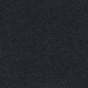
Tarkett
Granit Safe.T
Black Grey
Shaw Contract
Welcome II
Charcoal
Jacobsen
Langhorne Hut
Arbol
Tarkett
iQ Optima
Light Black
Tarkett Desso
Desert
AC89-9508
Tarkett Desso
Desert
AC89-9516
Shaw Contract
Strataworx
Surround Strataworx Blue Herring
Shaw Contract
Strataworx
Surround Strataworx Limestone
Tredsafe
Inserts Subtle Colours
Charcoal Grey 37 mm
Tarkett
iQ Optima
Medium Cool Grey
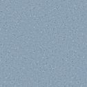
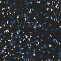
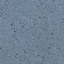
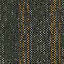
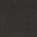
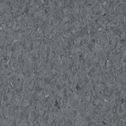
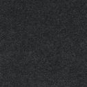
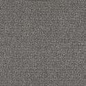
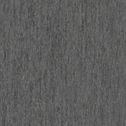
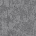
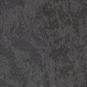
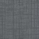
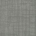
Grey:
Associated with calmness and neutrality; combined with stimulating colours it promotes balance.
Recommended use: Use to balance feature colours, allowing for a more focused visual hierarchy where brighter elements stand out.